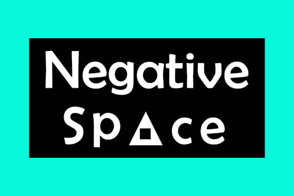
Negative space in Graphic Design, also referred to as white space, is an integral aspect of graphic design. It encompasses the unoccupied or unmarked areas within a design composition. Although it may initially appear contradictory to intentionally leave empty space, negative space holds significant importance in the world of graphic design. Its purpose goes beyond mere emptiness, as it serves to establish balance, amplify visual impact, and facilitate effective message communication. In this article, we will delve into five ingenious applications of negative space in graphic design. By exploring these creative uses, we can gain a deeper appreciation for the versatility and power that negative space wields in the realm of visual communication.
1. Creating Optical Illusions
Negative space can be cleverly utilized to create optical illusions that captivate the viewer’s attention. By strategically placing elements and utilizing negative space, designers can make two-dimensional designs appear three-dimensional. This technique not only adds depth to the design but also engages the viewer’s imagination. An excellent example of this is the FedEx logo, where the negative space between the “E” and the “x” forms an arrow, symbolizing speed and precision.
2. Defining Shapes and Objects
Negative space can be used to define shapes and objects within a design. By manipulating the surrounding negative space, designers can guide the viewer’s perception and make the intended shapes or objects more apparent. This technique is particularly useful in logo design, where simplicity and clarity are essential. The iconic Nike “Swoosh” logo is a classic example of how negative space is utilized to define the shape of a checkmark, creating a recognizable and memorable symbol.
3. Enhancing Typography
Negative space can significantly impact the legibility and visual impact of typography. By allowing sufficient breathing space around letters and words, designers can improve readability and make the text more visually appealing. Negative space can also be cleverly incorporated within the letters themselves, creating unique and eye-catching typographic designs. This technique is commonly seen in logo designs and posters, where the negative space within the letters adds an extra layer of meaning and creativity.
4. Conveying Hidden Messages
Negative space can be ingeniously utilized to convey hidden messages or additional meanings within a design. By manipulating the negative space, designers can hide symbols or create subtle visual cues that reveal themselves upon closer examination. One famous example is the Tour de France logo, where the letters “R” and “N” create the silhouette of a cyclist, emphasizing the event’s nature. These hidden messages add an element of intrigue and reward observant viewers.
5. Establishing Balance and Harmony
Negative space plays a vital role in establishing balance and harmony within a design. It helps to distribute elements effectively, allowing them to breathe and preventing overcrowding. By carefully considering the negative space, designers can create a sense of equilibrium and ensure that the design feels visually pleasing and well-proportioned. This principle is particularly evident in minimalist designs, where the strategic use of negative space creates an elegant and sophisticated aesthetic.
In conclusion, negative space is a powerful tool in the arsenal of graphic designers. Its clever use can create optical illusions, define shapes and objects, enhance typography, convey hidden messages, and establish balance and harmony within a design. By leveraging the potential of negative space, designers can create visually compelling and impactful designs that leave a lasting impression on viewers. So, the next time you embark on a graphic design project, don’t forget to embrace the power of negative space and let it work its magic.
WHAT’S OUT THERE: 50 mesmerising designs that make the most of negative space


